How to Shade a Coloring Page (Shadows and Highlights)
Quick answer
To shade a coloring page, decide where the light is coming from, then build darker tone on the areas farthest from it — usually edges, folds, and undersides. Press lightly and layer gradually so the color deepens smoothly instead of jumping. Keeping the lightest areas near your light source gives flat line art a sense of depth.
By the TheColoringPages.net team. Reviewed for accuracy, September 2026.
This guide to Shade Coloring Page gives clear, practical answers, drawing on shading and years of hands on coloring.
Shading is the technique that turns flat coloring into art that looks three dimensional and real. By adding darker tones where shadows fall and keeping lighter areas where light hits, you make objects look rounded, solid, and lifelike. It sounds advanced, but the basic idea is simple, and even beginner shading dramatically improves a page.
This guide explains how to shade a coloring page, from choosing a light source to building shadows and keeping highlights, so you can add depth to your coloring with any supplies.
Quick answer: To shade, pick one light direction, then darken the areas facing away from it and lighten or leave white the areas facing toward it. Build shadows with layers of a darker tone, keep highlights light, and blend the transition. This creates a three dimensional, realistic look. Start by shading one side of simple objects.

Why shading adds depth
Understanding why shading works helps you apply it well.
In the real world, objects are lit from a direction, so one side is bright and the other is in shadow. This variation of light and dark is how our eyes perceive three dimensional form. A flat, evenly colored shape looks flat because it lacks this variation. Adding shadow and highlight recreates the way light falls on real objects, so a colored shape looks rounded and solid.
Shading is essentially about value, the lightness or darkness of a color. By varying the value across an object, dark in shadow, light in the highlights, you create the illusion of form and depth. This is what separates flat coloring from realistic, dimensional coloring. It is one of the most powerful techniques in coloring.
The good news is that the basic principle is simple: pick a light direction, then make the far side darker and the near side lighter. Everything else is refinement. Even applying this simple idea transforms a page. Our guide on coloring techniques for beginners covers shading as a core skill, and once you grasp the basic principle, the rest is refinement you can add over time.
Pick a light source
The first and most important step in shading is deciding where the light comes from.
Choose a single direction for your light source, such as the top left of the page. This decision guides all your shading: the areas facing the light stay bright, and the areas facing away fall into shadow. Keeping one consistent light source across the whole page makes your shading look coherent and realistic. Inconsistent light, with shadows in random places, looks wrong.
Imagine the light shining onto each object from your chosen direction. The parts of the object facing the light are the highlights, the lightest areas. The parts facing away are in shadow, the darkest areas. The parts in between transition from light to dark. This simple mental model tells you where to place your lights and darks on every object.
Once you have chosen your light source, stick with it for the whole page. Every object should be lit from the same direction, with highlights on the same side and shadows on the same side. This consistency is what makes shading believable. Deciding your light source before you shade is the key first step. Our guide on how to color like a pro covers shading in the wider context of building a polished page.
Building shadows
With your light source chosen, building the shadows is the heart of shading.
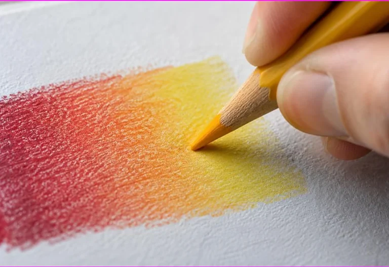
Add your darker tone to the areas facing away from the light, building it up in light layers rather than pressing hard. Layering the shadow gradually lets you control how dark it becomes and keeps the transition smooth. The areas deepest in shadow, furthest from the light, are the darkest, while the shadow lightens as it approaches the lit side.
Use a darker version of your base color for natural shadows. Shading a red apple, for example, use a deeper red or a red mixed with a little brown or blue in the shadow areas, rather than black, which can look harsh and flat. Building shadow from a darker tone of the base color gives a more natural, realistic result. For softer shadows, a touch of the object’s complementary color can work too.
Blend the shadow into the base color so there is no hard line between light and dark, unless the object has a sharp edge. A smooth transition from light to shadow looks realistic and rounded. Our guides on blending colored pencils and blending markers cover creating smooth transitions. Building shadows this way, layered, from a darker base tone, and blended, gives natural, effective shading.

Keeping highlights
Highlights, the lightest areas, are as important as shadows for creating depth.
Keep the areas facing the light bright, or even leave them the white of the paper for the brightest highlights. The contrast between these light highlights and the darker shadows is what creates the sense of form and makes a page pop. Without bright highlights, shading can look muddy and flat, so preserving the lights matters as much as adding the darks.
Plan your highlights before you start coloring an object. Decide which areas face the light most directly, and keep those the lightest, coloring them lightly or leaving them white. It is much easier to leave a highlight light from the start than to try to lighten an area after coloring it dark, especially with markers, which are hard to lighten.
The interplay of light highlights and dark shadows is the essence of shading. A well shaded object moves from a bright highlight, through the base color, to a deep shadow, creating a smooth range of values that reads as three dimensional. Keeping your highlights bright, and your shadows dark, with a smooth transition between, is what makes shading work. Our guide on color large areas evenly covers controlling value.
Shading with pencils versus markers
The tool you use affects how you shade, so it helps to know the differences.
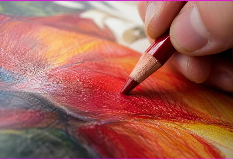
With colored pencils, shading is built up in light layers. You layer the base color, then layer the darker shadow tone in the shadow areas, building depth gradually and blending the transition. Pencils give fine control over shading, letting you build subtle, gradual shadows and keep precise highlights. This control makes pencils excellent for detailed, realistic shading. Our guide on colored pencil layering and burnishing covers building value with pencils.
With markers, shading uses different tones of marker and blending while wet. You might use a light, medium, and dark marker of the same color, applying the dark in the shadows and blending it into the lighter tones while wet, as our guide on how to blend markers covers. Alcohol markers, which blend smoothly, are well suited to marker shading. Keeping highlight areas uncolored or using the lightest marker preserves the lights.
Both tools can shade beautifully with practice. Pencils suit gradual, controlled, detailed shading, while markers suit smooth, bold shading with blended tones. Whatever your tool, the principles are the same: consistent light source, dark shadows built up, bright highlights kept, and smooth transitions. Matching your technique to your tool gets the best results.
A simple shading exercise
A simple exercise builds your shading skill quickly, so it is worth practicing.
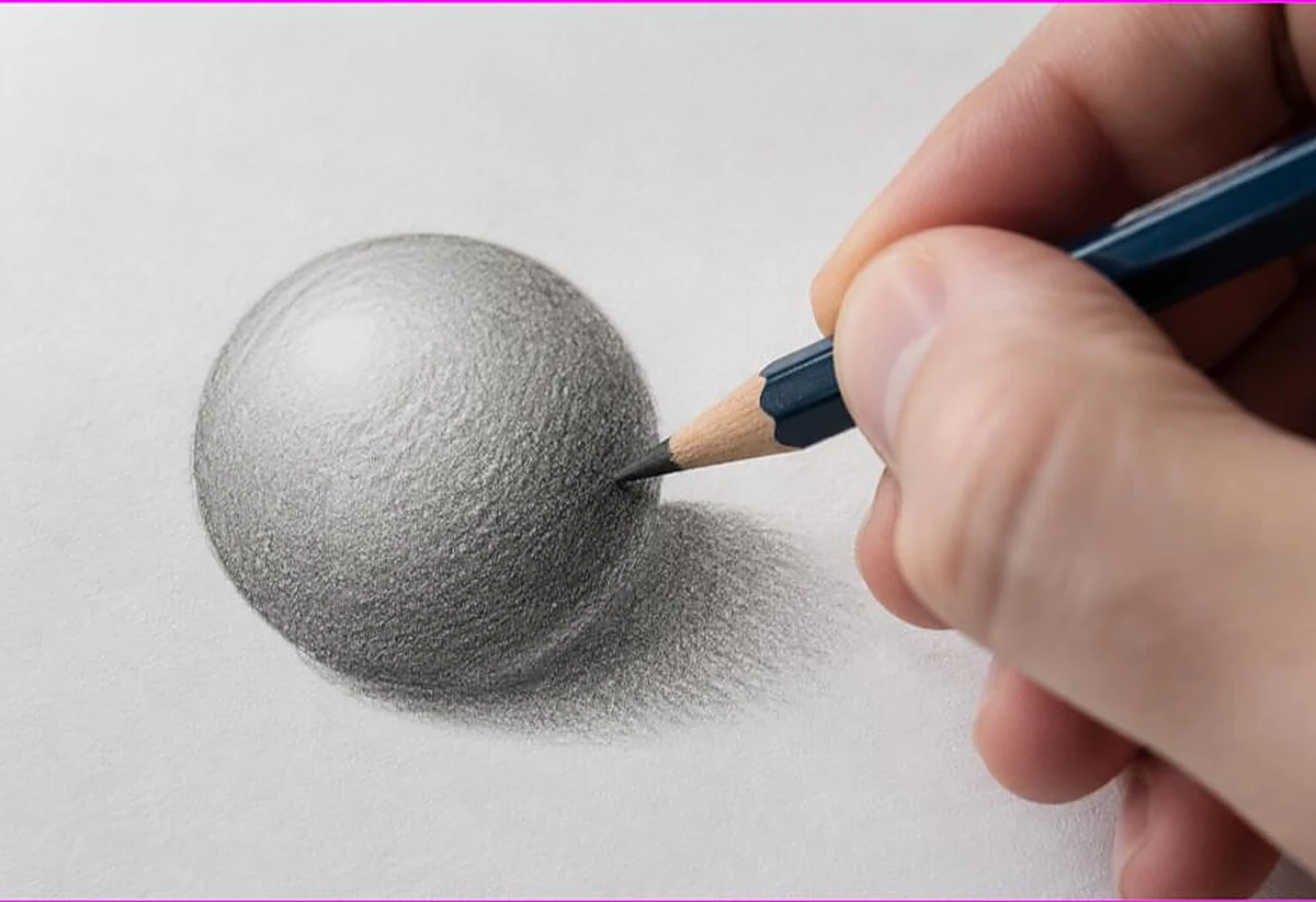
Draw or find a simple circle, and shade it to look like a ball. Choose a light source, say the top left. Keep the top left of the circle light, or white, for the highlight. Add your darker tone to the bottom right, where the shadow falls, building it up in layers. Blend the shadow into the lighter area so the transition is smooth. Add a cast shadow beneath the ball on the ground for extra realism.
This ball exercise teaches the core of shading: light source, highlight, shadow, and transition. Once you can make a flat circle look like a three dimensional ball, you understand shading. Practice it with different light directions and colors to build your feel for where light and shadow fall.
Then apply the same principle to objects on your coloring pages. Every object is lit from your chosen direction, with highlights facing the light and shadows facing away. Shading simple objects first, then more complex scenes, builds your skill steadily. This exercise is the foundation, and regular practice makes shading feel natural. Our collection of free printable coloring pages gives you objects to practice shading on.

Adding shadows between objects and on the ground
Beyond shading individual objects, shadows between and beneath objects add realism to a whole scene.
Cast shadows are the shadows objects throw onto the ground or onto other objects. Adding a cast shadow beneath an object, on the side away from the light, grounds it in the scene and makes it look solid rather than floating. A simple darker area beneath an object, stretching away from the light, reads as its shadow and adds realism.
Shadows also fall where objects overlap or meet. Adding a little shadow where one object sits in front of another, or where objects touch, shows their relationship and depth. These small shadows between elements make a scene look layered and real, rather than flat. They are a simple addition that lifts a whole page.
Keep cast shadows consistent with your light source, falling away from the light, and keep them softer and lighter than the deepest shadows on the objects themselves. Building these scene shadows, alongside shading individual objects, creates a fully three dimensional, realistic page. It is an advanced touch, so add it once shading individual objects feels comfortable. Our guide on how to color like a pro covers building a complete page.
Frequently asked questions about shade coloring page
How do you shade a coloring page?
Pick one light direction, then darken the areas facing away from it and keep the areas facing toward it light. Build shadows in layers of a darker tone, keep highlights bright, and blend the transition. This creates a three dimensional, realistic look.
What color should I use for shadows?
Use a darker version of the object’s base color for natural shadows, rather than black, which looks harsh. For a red apple, use a deeper red. A touch of the complementary color can add depth. Building shadow from a darker base tone looks most realistic.
How do I keep highlights when shading?
Plan your highlights before coloring, and keep the areas facing the light bright or leave them white. It is easier to leave a highlight light than to lighten an area after coloring it dark. The contrast between bright highlights and dark shadows creates depth.
Is shading easier with pencils or markers?
Both work well. Colored pencils give fine control for gradual, detailed shading built in layers. Markers give smooth, bold shading with blended tones, especially alcohol markers. The principles are the same for both: consistent light, dark shadows, bright highlights.
How do I make coloring look 3D?
Add shading. Pick a light source, darken the shadowed side of objects, keep the lit side bright, and blend the transition. Add cast shadows beneath objects. This variation of light and dark makes flat shapes look rounded and three dimensional.
The takeaway on shade coloring page
Shading turns flat coloring into three dimensional art. Pick one light source, darken the areas facing away from it, keep the areas facing toward it bright, and blend the transition. Build shadows from a darker base tone in light layers, keep highlights light, and add cast shadows for realism. Practice on a simple ball, then apply the principles to your pages. With shading, your coloring gains the depth and realism that make it truly impressive. Take it one object at a time, keep your light source consistent, and let your skill build with each page you shade.
Ready to add depth to your coloring? Browse our free printable coloring pages and practice your shading. Every one is free to download and print.