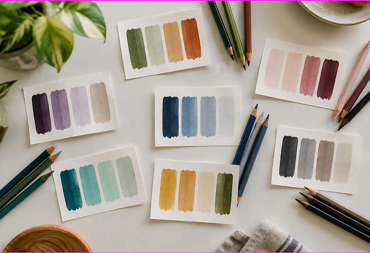
What Colors Go Together? (A Simple Cheat Sheet)
Quick answer
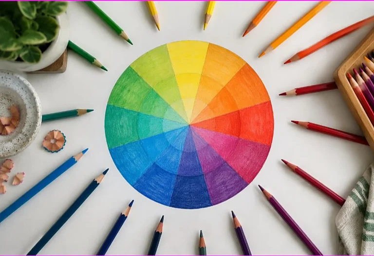
Colors go together in predictable ways on the color wheel: complementary pairs (opposites like blue and orange) create bold contrast, while analogous colors (neighbors like blue, teal, and green) feel calm and harmonious. For coloring, pick one main color, one or two supporting shades, and a small accent — three to four colors usually gives the cleanest, most pleasing result.
By the TheColoringPages.net team. Reviewed for accuracy, September 2026.
This guide to Colors Go Together gives clear, practical answers, drawing on color theory and years of hands on coloring.
Choosing colors that look good together is one of the biggest factors in how your coloring turns out, and it can feel like guesswork. The good news is that there are simple, reliable rules for which colors go together, based on the color wheel. Once you know a few winning combinations, you can color with confidence and get harmonious, pleasing results every time.
This guide is your practical cheat sheet for color combinations that work, from complementary pairs to analogous groups, plus how to use neutrals and choose colors by mood.
Quick answer: Colors that go well together follow the color wheel. Complementary pairs, blue and orange, red and green, yellow and purple, create bold contrast. Analogous groups, like blue, teal, and green, feel calm and cohesive. When unsure, pair one bright color with neutrals. Choosing a scheme and small palette before you start gives harmonious results.

Easy combinations that always work
Before the theory, here are reliable combinations you can use right away.
Blue and orange is a classic complementary pair that always looks striking, since the two contrast beautifully. Think of a sunset or a cozy autumn scene. Red and green is another complementary pair, festive and bold, perfect for holiday or nature themes. Yellow and purple is a third complementary pair, cheerful and eye catching.
For calm, harmonious combinations, try blues and greens together, like blue, teal, and green, which feel serene and cohesive. Reds, oranges, and yellows together give a warm, energetic feel, like a sunset or autumn. Pinks and purples together feel soft and pretty. These groups of related colors are easy on the eye and hard to get wrong.
When in doubt, pair one bright color with neutrals, browns, grays, beige, black, and white, which lets the bright color shine without clashing. These combinations, complementary pairs for contrast, related groups for harmony, and a bright with neutrals, cover most coloring beautifully. Keep them in mind and you have a reliable starting point for any page, whatever its subject or mood. The sections below explain why they work, using the color wheel.
Complementary pairs, with examples
Complementary colors, opposite on the color wheel, are the go to for bold, vibrant combinations.
The main complementary pairs are blue and orange, red and green, and yellow and purple. Because these sit opposite each other on the color wheel, they contrast strongly, making each color look more vivid and creating energetic, eye catching combinations. Placing them together makes both pop, which suits bold, lively pages.
Here are ways to use them. Blue and orange suits skies and sunsets, autumn scenes, and anything you want to feel warm and striking. Red and green suits holiday themes, flowers and leaves, and nature scenes. Yellow and purple suits cheerful, playful pages and floral designs. Using a complementary pair gives instant, reliable contrast.
For the best results, often use one color as the dominant color and its complement as an accent, rather than equal amounts, which can be overwhelming. For example, a mostly blue page with orange accents, or a green scene with red flowers. This gives the vividness of complementary contrast in a balanced, pleasing way. Complementary pairs are a powerful, reliable tool for bold coloring. Our guide on color theory for coloring covers the wheel.
Analogous groups
Analogous colors, neighbors on the color wheel, are the go to for calm, cohesive combinations.
Analogous groups are sets of colors next to each other on the wheel, such as blue, blue green, and green, or red, orange, and yellow, or yellow, yellow green, and green. Because these colors are related, they harmonize naturally, creating a calm, unified, pleasing look with no jarring contrast. They are among the easiest combinations to get right.
Here are ways to use them. Blues and greens together suit oceans, skies, forests, and calming, serene pages. Reds, oranges, and yellows together suit sunsets, autumn, fire, and warm, energetic scenes. Purples and pinks together suit soft, pretty, dreamy pages. Choosing a group of neighboring colors gives a cohesive, professional result almost automatically.
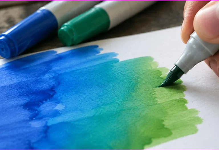
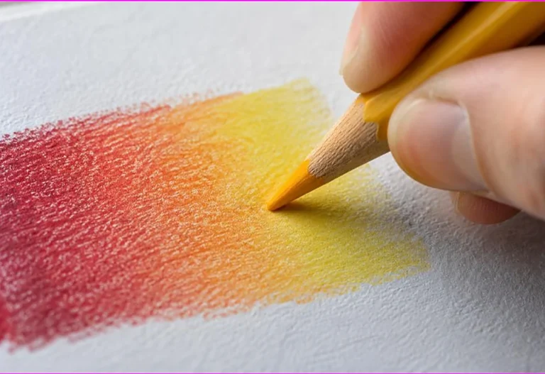
Analogous colors also blend beautifully, since they are close on the wheel, so they are perfect for smooth gradients. A sky blending through blues and blue greens, or a sunset through warm colors, uses analogous colors for a natural blend. For calm, cohesive, easy to blend coloring, analogous groups are your best friend. They are especially reliable for beginners, since related colors are hard to clash. Our guide on blending colored pencils covers blending them.

Using neutrals
Neutral colors are the quiet helpers that make any palette work, so it is worth knowing how to use them.
Neutrals are colors like brown, gray, beige, black, and white, which are not vivid and go with almost anything. They are invaluable for balancing a palette. Pairing a bright color with neutrals lets the bright color shine without competing with other bright colors, giving a clean, sophisticated look. When unsure what goes with a color, neutrals are a safe answer.
Neutrals also provide contrast and grounding. Adding some dark neutral, like a deep brown or gray, gives a page depth and anchors the brighter colors. White and light neutrals give breathing space and highlights. A page of all bright colors can feel overwhelming, but adding neutrals calms and balances it. This is why so many pleasing color schemes include neutrals.
Use neutrals generously alongside your main colors. Backgrounds, shadows, and secondary elements often look best in neutrals, letting your main colors take the spotlight. Combining a small palette of bright or harmonious colors with supporting neutrals gives a balanced, professional result. Neutrals are the reliable supporting cast that makes any color scheme work. They are especially useful when you want one color to stand out.
Combinations by mood
Choosing colors by the mood you want is a simple, intuitive approach that works well.
For a calm, peaceful mood, choose cool, analogous colors like blues, greens, and soft purples. These feel serene and restful, perfect for a relaxing page or a mandala for stress relief. For an energetic, cheerful mood, choose warm colors like reds, oranges, and yellows, or bright complementary pairs, which feel lively and uplifting.
For a soft, gentle mood, choose pastels, light versions of colors, which feel delicate and soothing. For a bold, dramatic mood, choose high contrast complementary pairs or deep, rich colors with strong shadows. For a natural, earthy mood, choose greens, browns, and warm neutrals, which feel grounded and organic.
Thinking about the mood you want makes color choice intuitive. Rather than agonizing over which colors to use, decide how you want the page to feel, then choose colors that match that feeling, using the combinations above. This mood based approach, backed by the color wheel relationships, makes choosing colors easy and gives results that feel right. Our guide on the benefits of mandala coloring covers calming color choices.
A cheat-sheet of go-to combinations
Here is a quick reference of reliable color combinations for different effects.
For bold contrast, use complementary pairs: blue and orange, red and green, or yellow and purple, with one dominant and one accent. For calm harmony, use analogous groups: blue, teal, and green, or red, orange, and yellow, or purple and pink. For balance and variety, use a triadic scheme of three evenly spaced colors, like the three primaries.
For a safe, elegant look, pair one bright color with neutrals: a bright color plus browns, grays, and white. For a serene mood, use cool colors: blues, greens, and soft purples. For a warm mood, use warm colors: reds, oranges, and yellows. For a soft mood, use pastels. For depth, include a range of light and dark values in any of these.
Keep this cheat sheet in mind, and you always have a reliable combination to reach for. Pick the effect you want, choose the matching combination, plan a small palette, and use it across your page. This takes the guesswork out of color and gives harmonious, pleasing results every time. With these go to combinations, choosing colors becomes easy and enjoyable. Our collection of free printable coloring pages gives you pages to try them on, from simple designs to detailed mandalas where a repeated palette really shines.
Planning your palette
Bringing it together, planning your palette before you start is the habit that ties good color choices into a beautiful page.
Before coloring, choose a small palette of colors that work together, based on the combinations above. Picking a scheme, complementary, analogous, or bright with neutrals, and selecting a few colors within it gives your page a unified, intentional look. This is far more effective than choosing colors one at a time as you go, which can lead to a jumble.
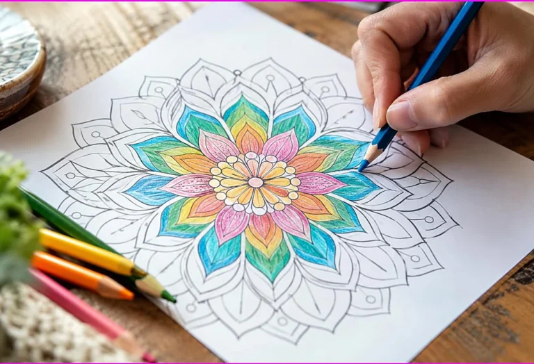
Use your palette across the whole page, repeating colors to tie it together. In a mandala or pattern, using the same palette in matching sections creates beautiful harmony. In a scene, repeating your palette colors in different elements unifies the page. This repetition of a planned palette is what gives coloring a cohesive, professional look.
Planning a palette takes only a moment and makes a big difference. It is the simplest way to ensure your colors go together, since you have chosen a harmonious set from the start. Combined with knowing which combinations work, palette planning makes beautiful color choices reliable and easy. It is a habit worth building for every page. Our guide on how to color like a pro covers using color in the wider context.

Testing color combinations first
Before committing colors to a whole page, a quick test can save you from a combination you do not like.
Try your chosen colors together on a scrap of paper, or on a small, hidden part of the page, before coloring the main areas. Coloring a small patch of each color side by side shows you how they look together and whether they harmonize the way you hoped. This quick check lets you adjust your palette before you commit, avoiding the disappointment of a combination that does not work once it fills the page.
You can also keep a simple swatch sheet of color combinations you like. As you find palettes that please you, note them down or color a small sample, building a personal reference of go to combinations. Over time this becomes a valuable resource, letting you reach for a proven palette rather than guessing each time. Many colorists keep such a reference.
Testing takes only a moment and builds your confidence and your eye for color. It removes the risk from trying new combinations, since you see the result small before committing it large. Combined with the color wheel relationships and the combinations above, testing helps you choose colors that always please you. Our collection of free printable coloring pages includes simple pages perfect for testing palettes.
Frequently asked questions about colors go together
What colors go well together?
Complementary pairs like blue and orange, red and green, or yellow and purple give bold contrast. Analogous groups like blue, teal, and green give calm harmony. Pairing one bright color with neutrals is always safe. Choose based on the effect you want.
What are the best color combinations for coloring?
For contrast, use complementary pairs with one dominant and one accent. For harmony, use analogous groups of neighboring colors. For balance, use a triadic scheme. For an elegant look, pair a bright color with neutrals. Choose by the mood you want.
How do I choose colors that don’t clash?
Use the color wheel relationships: related colors harmonize, and opposite colors contrast deliberately. Choose a scheme and a small palette before you start, and use neutrals to balance bright colors. This avoids the clashing that random color choices cause.
What colors make a page look calm?
Cool, analogous colors like blues, greens, and soft purples make a page feel calm and serene. Pastels also feel gentle and soothing. These are ideal for relaxing pages and mandalas. Avoid too many bright, high contrast colors for a calm effect.
Should I plan my colors before coloring?
Yes. Choosing a scheme and a small palette before you start, and using it across the page, gives a unified, harmonious, intentional look. This is far more effective than choosing colors one at a time, which can lead to a jumbled result.
The takeaway on colors go together
Choosing colors that go together is simple with the color wheel as your guide. Complementary pairs give bold contrast, analogous groups give calm harmony, and one bright color with neutrals is always safe. Choose colors by the mood you want, plan a small palette before you start, and use it across the page. With these reliable combinations and a little planning, your coloring will look harmonious and professional every time.
Ready to try some winning color combinations? Browse our free printable coloring pages and pick a palette for a design you love. Every one is free to download and print.